



50 Nano Banana 2.1 Prompts for Infographics, Posters & Instagram Carousels (2026)
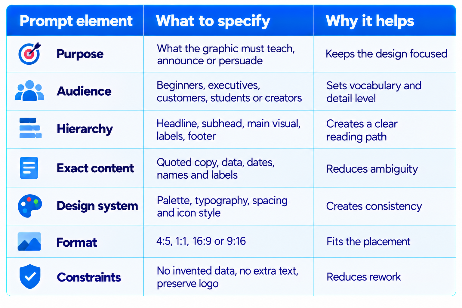
A strong infographic, poster or Instagram carousel is more than a pretty image. It has to explain one idea quickly, guide the viewer's eye, use readable typography and keep every visual element working toward the same message. That is why a well-written Nano Banana 2.1 prompt should describe the information hierarchy as carefully as the art direction.
Nano Banana 2.1 is Google's high-efficiency image generation and conversational editing model. Google's developer documentation highlights improved instruction following, text rendering, infographic layout accuracy, multi-turn character consistency, 1K, 2K and 4K output, and reference-image fusion. These features make it useful for first drafts of educational graphics, marketing posters, visual explainers and social media carousels. Check all important wording, numbers and chart values before publishing.
This collection contains 50 copy-paste Nano Banana 2.1 prompts for infographic design, event posters, data storytelling, Instagram carousel slides, business graphics, educational explainers and branded social content. Replace bracketed placeholders with your topic, brand, audience, colors, data or exact wording. For carousel consistency, use one shared design brief and preserve the same palette, typography, margins and icon style across slides.
Try these alongside our 100 Best Nano Banana Prompts 2026 (Copy-Paste)
QUICK ANSWER
The best Nano Banana 2.1 prompts for infographics, posters and Instagram carousels work like compact design briefs. State the audience and message, define the layout and reading order, provide exact text or data, specify the visual style and color palette, then set the aspect ratio. For carousel slides, request a consistent design system across all slides. For charts and factual graphics, provide real values and verify the final image before publishing.
Use 4:5 for many portrait social posts, 1:1 for square graphics and 9:16 for Stories or Reels covers. For carousels, portrait 4:5 is a practical starting point, but check the platform's current publishing requirements. If the design contains dense copy, generate the visual structure first and finish critical typography in a design editor.
How to Get Better Results from Nano Banana 2.1
- Replace every bracketed placeholder before generating.
- Provide exact facts, labels, dates and numbers instead of asking the model to invent them.
- Upload the real logo or a reference slide when brand fidelity matters.
- For carousels, repeat the same design-system instructions on every slide.
- Keep labels short and spacing generous for mobile readability.
- Inspect spelling, numbers, alignment and contrast before publishing.
Category 1: Educational and Explainer Infographics
1. Beginner-Friendly Concept Explainer
Create a polished educational infographic explaining [CONCEPT] to [AUDIENCE]. Use one clear headline, a one-sentence summary and four numbered sections with concise labels and simple icons. Use a clean editorial grid, generous white space, dark navy typography and [ACCENT COLOR]. Use only these source facts: [SOURCE FACTS]. Do not add unsupported claims. Portrait 4:5.
2. Step-by-Step How-To Infographic
Design an infographic titled '[TITLE]' showing exactly these steps: [STEP 1], [STEP 2], [STEP 3], [STEP 4]. Connect steps with arrows, use one icon per step, keep labels short and make the sequence obvious. Use [BRAND COLORS], consistent line icons and a modern layout. Preserve wording. 4:5.
3. Myth vs Fact Graphic
Create a myth-versus-fact infographic about [TOPIC]. Include only these pairs: [MYTH 1]/[FACT 1], [MYTH 2]/[FACT 2], [MYTH 3]/[FACT 3]. Use a two-column layout, strong labels, restrained icons and clear contrast. Do not invent claims or imply myths are endorsed advice. 4:5.
4. Beginner-to-Expert Learning Roadmap
Create a visual roadmap for learning [SKILL]. Show four stages: [STAGE 1], [STAGE 2], [STAGE 3], [STAGE 4], with two short skills under each. Use a connected path, clear progression, small icons and consistent spacing. Mobile-readable, portrait 4:5.
5. Glossary of Key Terms
Design a compact infographic titled '[TOPIC] Glossary'. Include these exact terms and definitions: [TERM 1: DEFINITION], [TERM 2: DEFINITION], [TERM 3: DEFINITION], [TERM 4: DEFINITION], [TERM 5: DEFINITION]. Use modular cards, bold terms and concise definitions. Do not add terms or rewrite definitions. 4:5.
6. Anatomy of a System
Create a labeled educational diagram of [SYSTEM]. Include only these parts: [COMPONENTS]. Use clear connector lines, a central illustration and a small legend. Keep connections logical and avoid crossing arrows. Professional technical-editorial style, [PALETTE], landscape 16:9.
7. Do and Don't Guide
Create a do-and-don't infographic for [TASK]. Left side: [DO LIST]. Right side: [DON'T LIST]. Use concise labels, matching icons and clear visual distinction. Preserve the meaning of every item and avoid clutter. 4:5.
8. One-Page Study Sheet
Create a revision sheet for [SUBJECT] for [STUDENT LEVEL]. Organize it into key concepts, essential formulas or facts, one worked example and common mistakes using [NOTES]. Use a strong title, tidy grid and high-contrast typography. Do not invent formulas. 4:5.
Category 2: Data, Statistics and Business Infographics
9. KPI Dashboard Snapshot
Create an executive infographic for [BUSINESS/PRODUCT] showing [METRIC 1 AND VALUE], [METRIC 2 AND VALUE], [METRIC 3 AND VALUE] and [METRIC 4 AND VALUE]. Use clear hierarchy and a restrained [PALETTE]. Label units, keep numbers exact and do not fabricate missing values. 16:9.
10. Survey Results
Turn these survey findings into an infographic: [QUESTION], [SAMPLE SIZE], [RESULTS AND PERCENTAGES]. Use a clearly labeled chart, include sample size and source note, and avoid implying causation. Preserve values exactly and leave room for methodology. 4:5.
11. Before-and-After Metrics
Create a before-and-after infographic for [METRIC], comparing [BEFORE PERIOD] with [AFTER PERIOD]. Use [BEFORE VALUE], [AFTER VALUE] and [UNIT]. Calculate changes only when possible from the supplied figures. Make periods explicit and avoid misleading scale. 4:5.
12. Quarterly Business Review
Design a quarterly performance infographic for [COMPANY/TEAM] with results, wins, challenges and next-quarter priorities. Use only [DATA]. Create a clean executive layout with a few charts and concise labels. Do not invent financial results. 16:9.
13. Market Segmentation Map
Create a market segmentation infographic for [PRODUCT CATEGORY] with [SEGMENT 1], [SEGMENT 2], [SEGMENT 3] and [SEGMENT 4]. For each, show the supplied need, value proposition and channel: [SEGMENT DATA]. Use a tidy matrix. Do not fabricate market-size numbers. 16:9.
14. Budget Allocation
Create a budget-allocation infographic using this exact dataset: [CATEGORY AND AMOUNT/PERCENTAGE]. Use a labeled bar or donut chart, show units and total, and distinguish categories with a consistent palette. Do not change values. Add a source note. 4:5.
15. Project Timeline
Create a timeline for [PROJECT] using these milestones and dates: [MILESTONES]. Arrange chronologically, use readable labels and clear connectors, and distinguish completed, active and planned items only as specified. Do not invent dates. 16:9.
16. Product Comparison Matrix
Create a comparison infographic for [PRODUCT A], [PRODUCT B] and [PRODUCT C] across [CRITERIA AND VERIFIED VALUES]. Use a clean matrix and neutral emphasis. Do not declare a winner unless evidence supports it. Mark missing data 'Not provided'. 16:9.
Category 3: Posters, Campaigns and Event Graphics
17. Professional Event Poster
Create a poster for '[EVENT NAME]' on '[DATE]' at '[LOCATION]'. Include '[SUBTITLE]' and CTA '[CALL TO ACTION]'. Use [VISUAL THEME], [BRAND COLORS], strong headline hierarchy and generous spacing. Preserve names, date and location exactly. Leave space for the supplied logo. 4:5.
18. Product Launch Poster
Design a premium launch poster for [PRODUCT]. Headline: '[HEADLINE]'. Supporting copy: '[SUBHEAD]'. CTA: '[CTA]'. Feature the product as hero object, use [LIGHTING STYLE] and [BRAND PALETTE]. Do not invent features. 4:5.
19. Webinar Promotion
Create a promotional poster for webinar '[WEBINAR TITLE]' featuring [SPEAKER] on [DATE] at [TIME AND TIME ZONE]. Include [AUDIENCE BENEFIT] and CTA '[REGISTRATION CTA]'. Use a professional tech-event aesthetic and space for portrait or logo. Preserve details. 4:5.
20. Sale or Offer Poster
Create a retail poster for [BRAND] promoting [OFFER]. Exact headline: '[HEADLINE]'. Exact terms: '[TERMS]'. Use [BRAND COLORS], a prominent product image and clear hierarchy. Do not add unsupported urgency, prices or conditions. 4:5.
21. Nonprofit Awareness Poster
Create an awareness poster about [CAUSE] for [AUDIENCE]. Main message: '[MESSAGE]'. Requested action: '[ACTION]'. Use empathetic imagery, accessible contrast and a clear focal point. Do not invent statistics or use exploitative imagery. 4:5.
22. Conference Speaker Poster
Create a speaker poster for [SPEAKER NAME], [TITLE/ROLE], speaking about '[SESSION TITLE]' at [EVENT]. Use the supplied portrait and preserve identity. Include [DATE], [VENUE] and [CTA] exactly. Modern editorial design, clean margins, 4:5.
23. Podcast or Newsletter Cover
Design a cover for '[PODCAST/NEWSLETTER NAME]' with subtitle '[SUBTITLE]'. Visual theme: [THEME]. Use one central symbol, a restrained palette, bold readable typography and negative space. Make the title legible at thumbnail size. 1:1.
24. Minimal Quote Poster
Create a minimalist poster containing exactly '[QUOTE]' and attribution '[NAME]'. Use [TYPOGRAPHY STYLE], [BACKGROUND STYLE] and [PALETTE]. Prioritize readability and negative space. Do not alter the quote or invent attribution. 4:5.
Category 4: Instagram Carousel Prompts
25. Seven-Slide Educational Carousel
Create slide 1 of a seven-slide Instagram carousel about [TOPIC] for [AUDIENCE]. Use a consistent system: [PALETTE], [TYPE STYLE], [CARD STYLE], page number and [ICON STYLE]. Headline '[HOOK]' and promise '[OUTCOME]'. Leave negative space for mobile readability. 4:5. Preserve this system on later slides.
26. Carousel Slide: The Problem
Create slide [NUMBER] of the same carousel about [TOPIC]. Match reference slide colors, typography, margins, icons and background. Explain [PROBLEM] with one headline, no more than three supporting points and one visual metaphor. Do not introduce a new style. 4:5.
27. Carousel Slide: Three-Step Tutorial
Create a carousel slide showing exactly three steps for [TASK]: [STEP 1], [STEP 2], [STEP 3]. Use three numbered cards, consistent icons and clear reading order. Match [REFERENCE DESCRIPTION]. Keep text mobile-readable and do not add a fourth step. 4:5.
28. Carousel Slide: Mistakes to Avoid
Create a slide titled '[TITLE]' showing [MISTAKE 1], [MISTAKE 2] and [MISTAKE 3], paired with [CORRECTIONS]. Use clear grouping, concise copy and the same [PALETTE] and typography as the previous slide. Avoid tiny text. 4:5.
29. Carousel Slide: Checklist
Create a save-worthy checklist slide for [TOPIC]. Include exactly [ITEMS]. Use clear checkboxes, title '[TITLE]', generous spacing and footer '[BRAND/ACCOUNT]'. Match the supplied carousel reference. Do not add checklist items. 4:5.
30. Carousel Slide: Comparison
Create a comparison slide for [OPTION A] and [OPTION B] across [CRITERIA]. Use the exact facts [FACTS]. Balance both columns, highlight differences without misleading color coding and avoid a universal winner claim. Match [REFERENCE]. 4:5.
31. Carousel Slide: Case Study
Create a case-study slide about [PROJECT/RESULT]. Include context '[CONTEXT]', action '[ACTION]' and verified result '[RESULT]'. Use a three-part layout, one visual focal point and source note if provided. Do not invent metrics. 4:5.
32. Carousel Final Slide with CTA
Create the final slide of a [NUMBER]-slide carousel about [TOPIC]. Takeaway: '[TAKEAWAY]'. Exact CTA: '[CTA]'. Account name: '[HANDLE]'. Use a clear finish, consistent brand styling and ample negative space. Do not add extra text. 4:5.
Category 5: Tech, AI and Creator-Economy Graphics
33. AI Workflow Infographic
Create an infographic showing an AI workflow for [TASK]. Stages: [INPUT], [MODEL/PROCESS], [REVIEW], [OUTPUT]. Use arrows, simple technical icons and concise labels. Distinguish automated steps from human approval. Do not imply unlisted capabilities. 16:9.
34. AI Model Comparison Graphic
Create a neutral comparison graphic for [MODEL A], [MODEL B] and [MODEL C] using verified [BENCHMARKS], [PRICE], [CONTEXT] and [SPEED]. Show units, label missing values unavailable and avoid mixing benchmark versions. 16:9.
35. Prompt Engineering Cheat Sheet
Create a visual cheat sheet titled 'A Better Prompt in 5 Parts'. Include role, task, context, constraints and output format, each with one short example for [USE CASE]. Use an editorial grid, small icons and legible labels. Do not add a sixth principle. 4:5.
36. AI Safety Checklist
Create a checklist infographic for safely deploying [AI TOOL/AGENT]. Include [PERMISSIONS], [DATA RULES], [HUMAN APPROVAL], [LOGGING] and [ROLLBACK]. Use clear icons and concise actions. Do not suggest a checklist guarantees safety. 4:5.
37. Creator Content Funnel
Create a content funnel for [CREATOR/BRAND] showing [DISCOVERY], [EDUCATION], [TRUST], [CONVERSION] and [RETENTION]. Add supplied channels [CHANNELS]. Use a clear connected-path layout and consistent icons. 16:9.
38. Social Media Content Calendar
Create a weekly social content calendar for [BRAND] using [CALENDAR DATA]. Use a seven-day grid, distinguish formats with small icons and preserve all dates and labels. Match [BRAND COLORS]. Do not add posts or dates. 4:5.
39. Brand Style Guide Snapshot
Create a one-page visual brand guide for [BRAND] using supplied logo and details. Include palette [COLORS], typography [TYPE], image style [IMAGE STYLE] and icon style [ICON STYLE]. Preserve logo proportions and exact colors. 16:9.
40. Blog Cover Graphic
Create a professional cover for article '[TITLE]' about [TOPIC]. Use one central visual metaphor, [PALETTE], subtle depth and negative space for the title. Avoid clutter, random UI text and unsupported claims. Technology publication style, 16:9.
Category 6: Advanced Layouts and Reusable Design Systems
41. Long-Form Infographic Poster
Create a long infographic about [TOPIC] with sections [SECTION 1], [SECTION 2], [SECTION 3], [SECTION 4], [SECTION 5] in that order. Use top-to-bottom reading flow, dividers, concise labels and consistent icons. Use only [SOURCE CONTENT]. Prioritize legibility and safe margins. 2:3.
42. Three-Panel Comparison Poster
Create a three-panel poster comparing [A], [B] and [C] across [CRITERIA]. Keep panels equal, labels aligned and visual scale consistent. Use supplied facts and units only, with [PALETTE] and subtle separators. 16:9.
43. Isometric Process Illustration
Create an isometric visual explanation of [PROCESS/SYSTEM] with [COMPONENTS]. Arrange components in the correct sequence and connect them clearly. Use limited [PALETTE], consistent perspective and short labels. Avoid decorative objects that resemble functional components. 16:9.
44. Editorial Magazine Infographic
Design an editorial infographic for [TOPIC] aimed at [AUDIENCE]. Include headline, central illustration, two supporting data points [DATA] and takeaway '[TAKEAWAY]'. Use elegant typography, restrained color and whitespace. Keep data exact and cite supplied source in footer. 4:5.
45. Reusable Brand Carousel System
Create a reusable six-slide Instagram carousel template for [BRAND]. Define title placement, body area, footer, page number, icon style, background, palette [COLORS] and type hierarchy. Show six sample layouts with one unified identity. Use placeholders, not invented copy. 16:9.
46. Local Business Promotion
Create a promotional graphic for [LOCAL BUSINESS] advertising [SERVICE/OFFER]. Include exact business name, offer, location and CTA [DETAILS]. Use relevant imagery, clear hierarchy and [BRAND COLORS]. Do not invent ratings, testimonials, prices or hours. 4:5.
47. Accessibility-First Infographic
Create an accessible infographic about [TOPIC] using high-contrast text, plain-language labels, large type, clear spacing and icons that are not the only way to communicate meaning. Use exact content [CONTENT]. Avoid color-only distinctions and crowded legends. 4:5.
48. Multilingual Poster Localization
Adapt the supplied poster into [LANGUAGE], preserving layout, identity, hierarchy and meaning. Translate only provided text, preserve brand names and numbers, and allow space for longer phrases. Use the uploaded reference. Do not change date, price or CTA. 4:5.
Bonus Prompts: More Practical Design Assets
49. Lead Magnet Cover
Create a polished cover graphic for a downloadable guide titled '[GUIDE TITLE]' for [AUDIENCE]. Include subtitle '[SUBTITLE]' and brand [BRAND]. Use one strong visual metaphor, clear title hierarchy, restrained [PALETTE], subtle depth and generous margins. Keep the title exact and avoid adding fake badges, ratings or claims. Portrait 2:3.
50. Interactive Workshop Worksheet
Create a one-page visual worksheet for a workshop about [TOPIC]. Include sections '[SECTION 1]', '[SECTION 2]' and '[SECTION 3]' with blank space for participants to write answers. Use concise instructions [INSTRUCTIONS], clear dividers, accessible contrast and a clean professional style. Do not fill in answers or add unsupported content. Portr
A Practical Workflow for Publishing AI-Generated Graphics
- Write the content first. Finalize the headline, labels, statistics, CTA and source notes before generating the graphic.
- Generate the layout. Ask Nano Banana 2.1 for hierarchy, imagery, spacing and palette, with short exact text.
- Use reference assets. Upload the official logo, existing carousel slide or brand guide when consistency matters.
- Iterate one change at a time. Ask for more whitespace, stronger contrast or a larger title rather than rewriting everything.
- Check factual content. Compare every number, date, name, chart label and quote with the source material.
- Finish typography when necessary. For dense copy, use the generated image as a visual base and add final text in a design editor.
- Export for the destination. Check the crop and readability at mobile size before publishing.
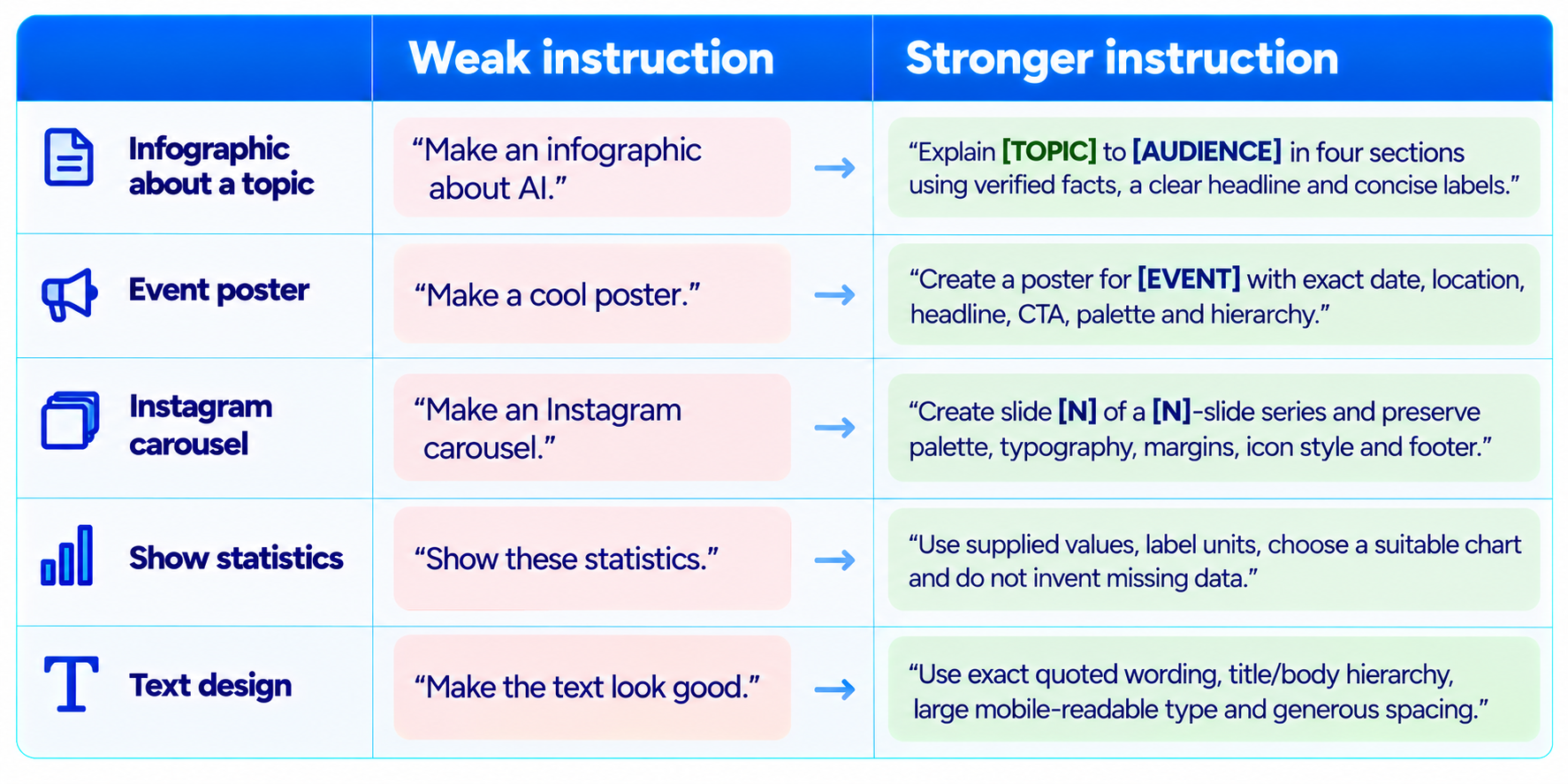
Weak Prompt vs Strong Prompt
Common Mistakes to Avoid
- Overloading one image with paragraphs, tiny labels and competing focal points.
- Assuming dense text or chart geometry will be perfect without checking the output.
- Generating every carousel slide from scratch without a shared reference.
- Leaving out units, source notes or date ranges on charts and statistics.
- Using a logo from memory instead of uploading the real asset.
- Changing multiple visual variables at once during iteration.
- Publishing AI-generated statistics or claims without checking the original source.
Frequently Asked Questions
What is Nano Banana 2.1?
Nano Banana 2.1 is Google's high-efficiency image generation and conversational editing model. Its developer documentation highlights instruction following, text rendering, infographic layout accuracy and reference-image fusion.
What are the best prompts for infographics?
Specify the audience, exact content, number of sections, visual hierarchy, palette and aspect ratio rather than giving a vague request.
Can Nano Banana 2.1 make Instagram carousels?
It can create individual slides and visual templates. Use a shared reference slide and repeat typography, palette, margins and icon rules.
What aspect ratio is best for Instagram carousels?
Portrait 4:5 is a practical starting point for feed carousels. Check current platform specifications and preview the crop.
Can it create posters with text?
Text rendering is a documented focus, but verify spelling, dates, names, prices and fine print before commercial use.
Can it create data charts?
It can create chart-style visuals from supplied data, but check chart values and geometry. For exact reporting, use a charting tool for the data itself.
How do I keep carousel slides consistent?
Create a visual system first, provide a reference slide and repeat palette, typography, margins, footer and icon instructions.
Can I use these prompts for business marketing?
Yes. They cover product launches, event promotion, local offers, brand guides, calendars and marketing infographics. Verify claims and offer details.
Should exact text be included in the prompt?
Yes for headlines, dates, names, prices and chart labels. Put the wording in quotes and instruct the model not to change it.
How do I get professional results?
Specify audience, one central message, clear hierarchy, limited palette, consistent spacing, aspect ratio and factual constraints.
Recommended Blogs
Resources & Community
Join our community of 70,000+ AI enthusiasts and learn to build powerful AI applications. Build Fast with AI helps creators, developers and teams understand and implement practical AI.
Agentic AI Launchpad 2026
A structured six-week cohort program that takes learners from AI basics to building and deploying real-world agentic AI systems, with live sessions, expert mentorship, project reviews and a builder community.
Explore the next cohort: Agentic AI Launchpad 2026
Free AI Resources
Explore free tools, workshops and micro-learning to keep building.

